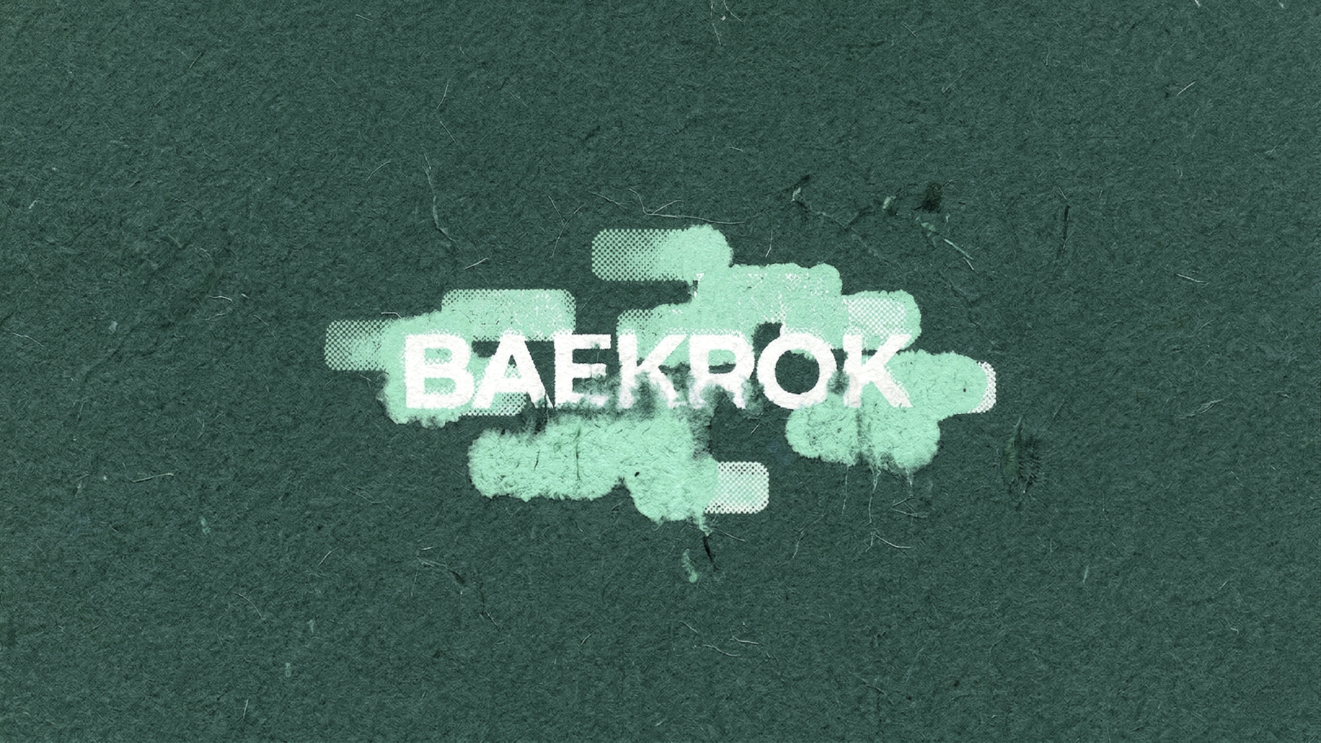
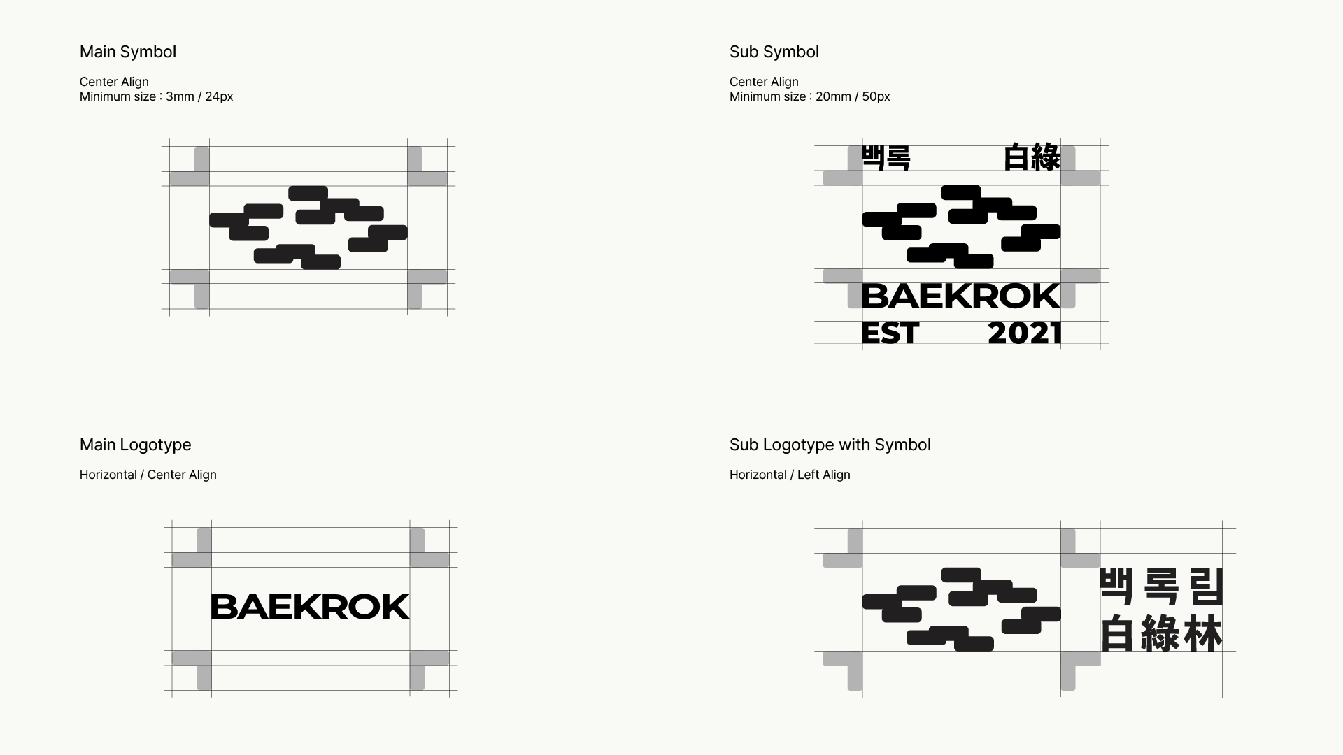
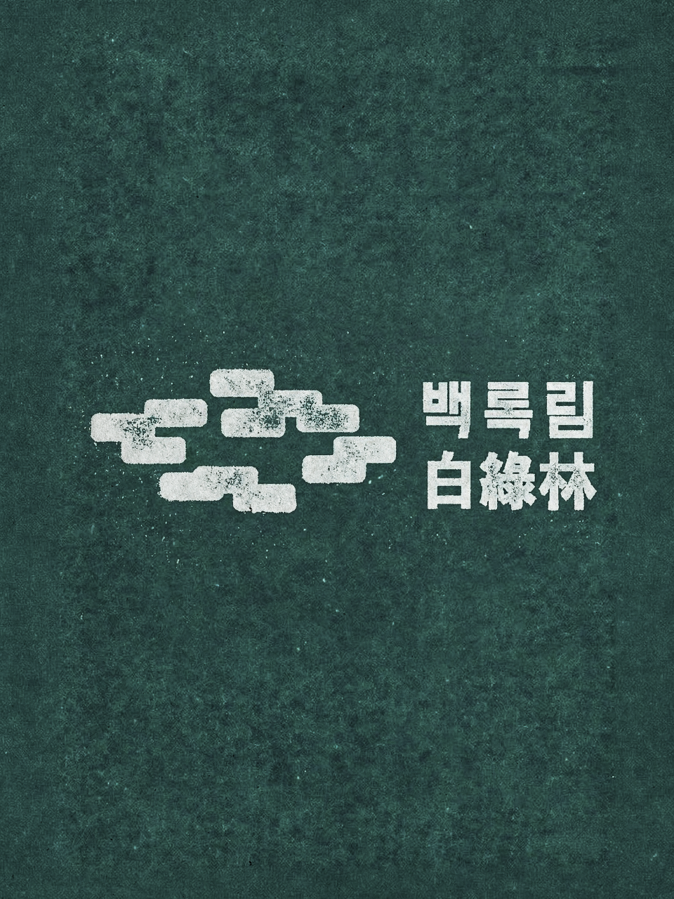
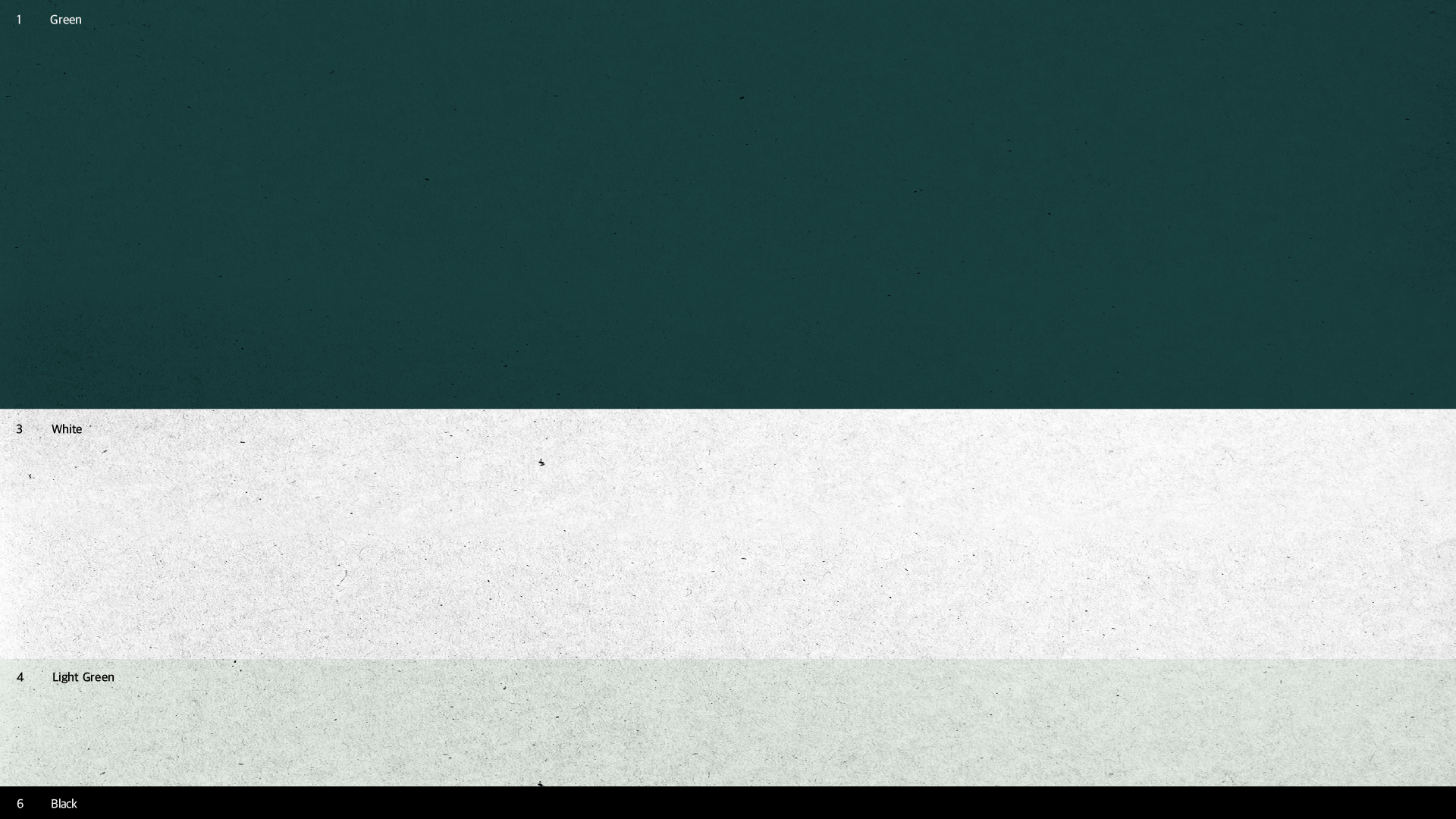
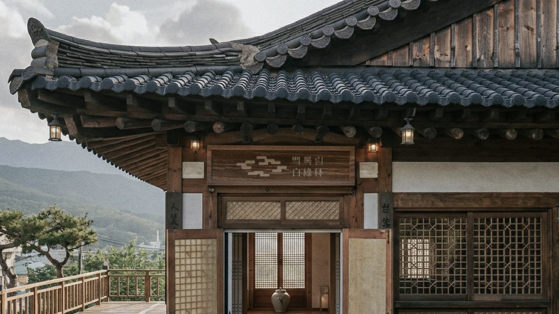
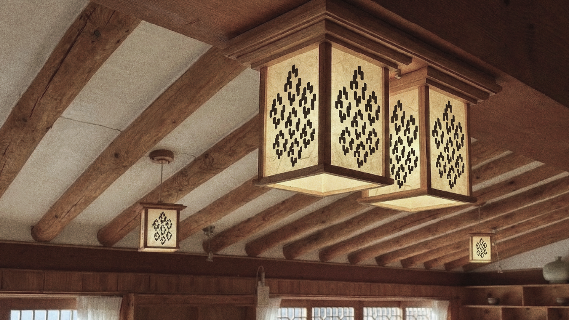
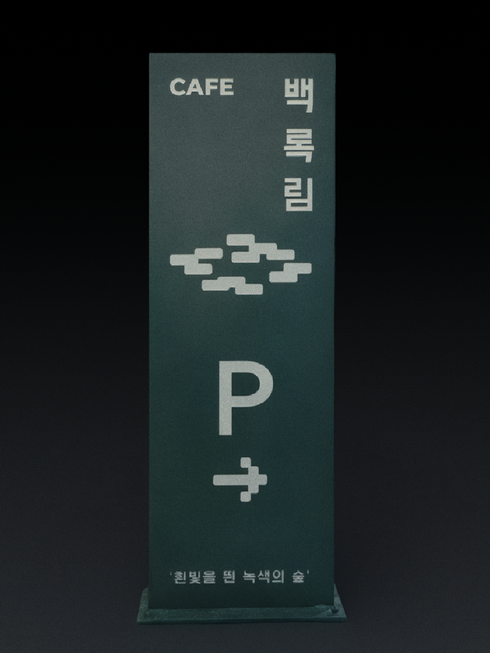
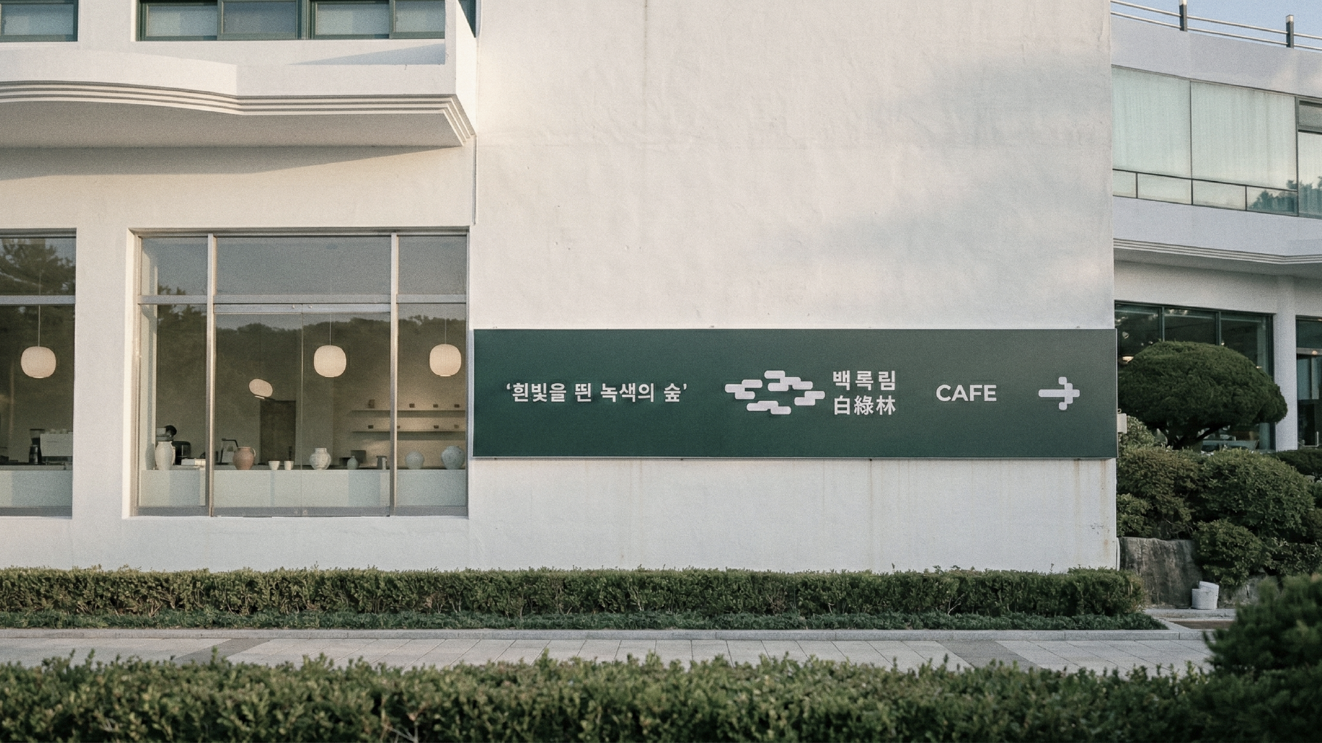
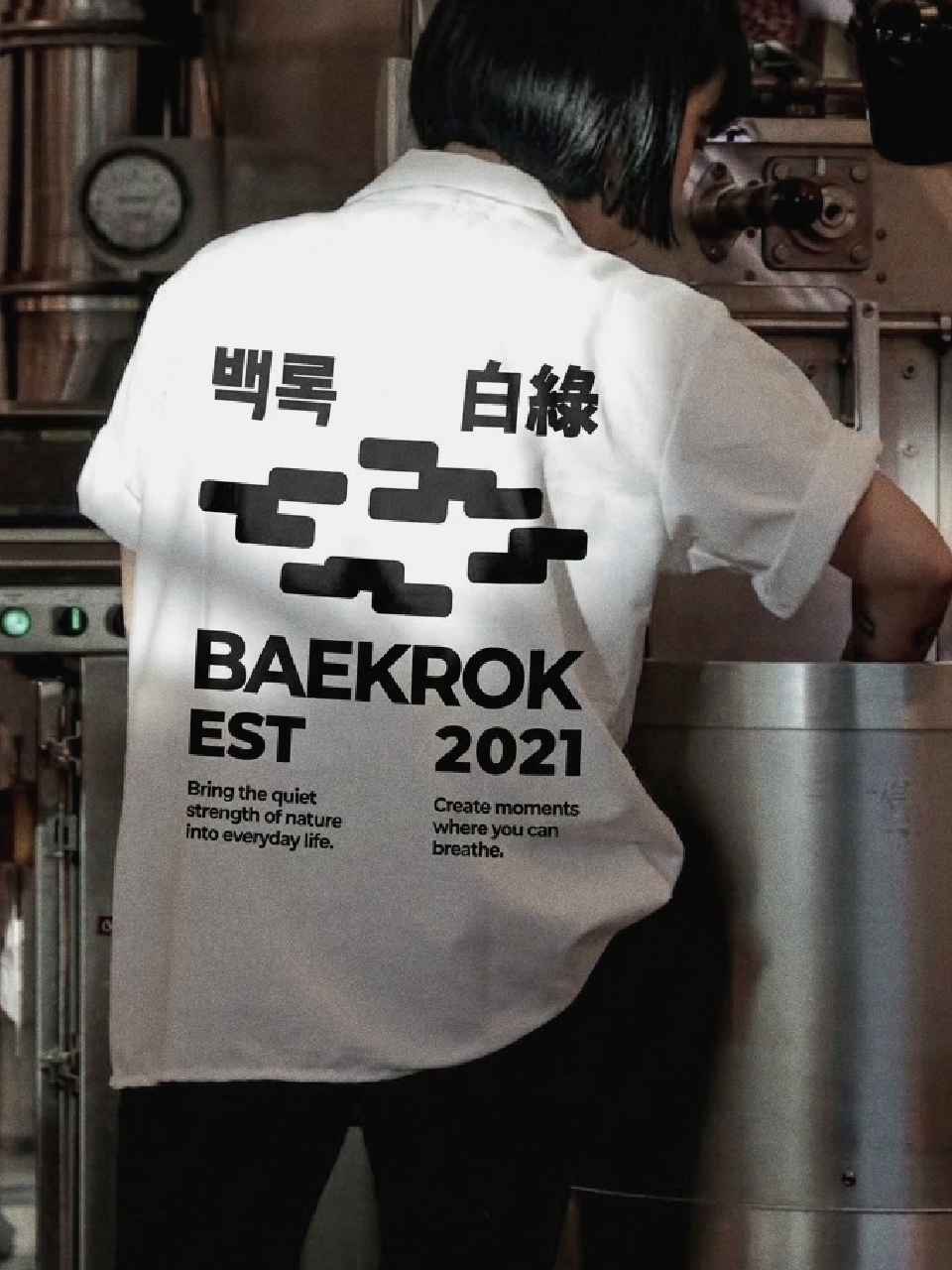
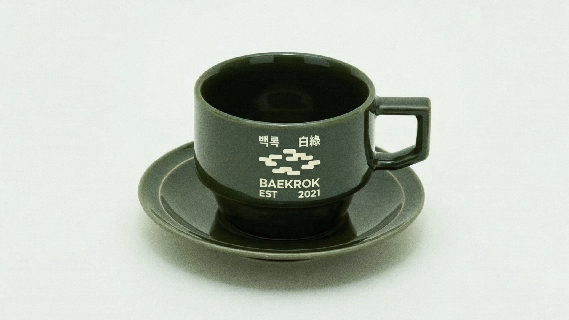
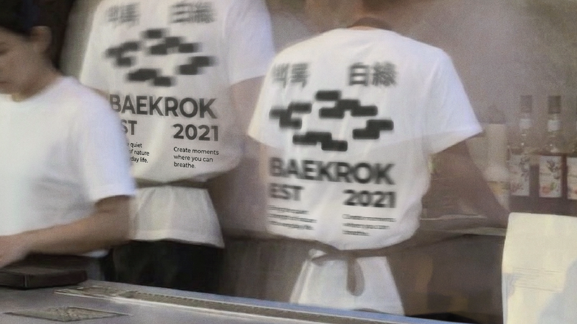
JDNS developed the brand logo identity for BAEKROK (白綠), a cafe located in the pottery village of Yangsan. 'BAEKROK' defines a moment where the static aesthetics of the pottery village and the vitality of the forest coexist through the harmony of pure 'White (白)' and clear 'Green (綠).'
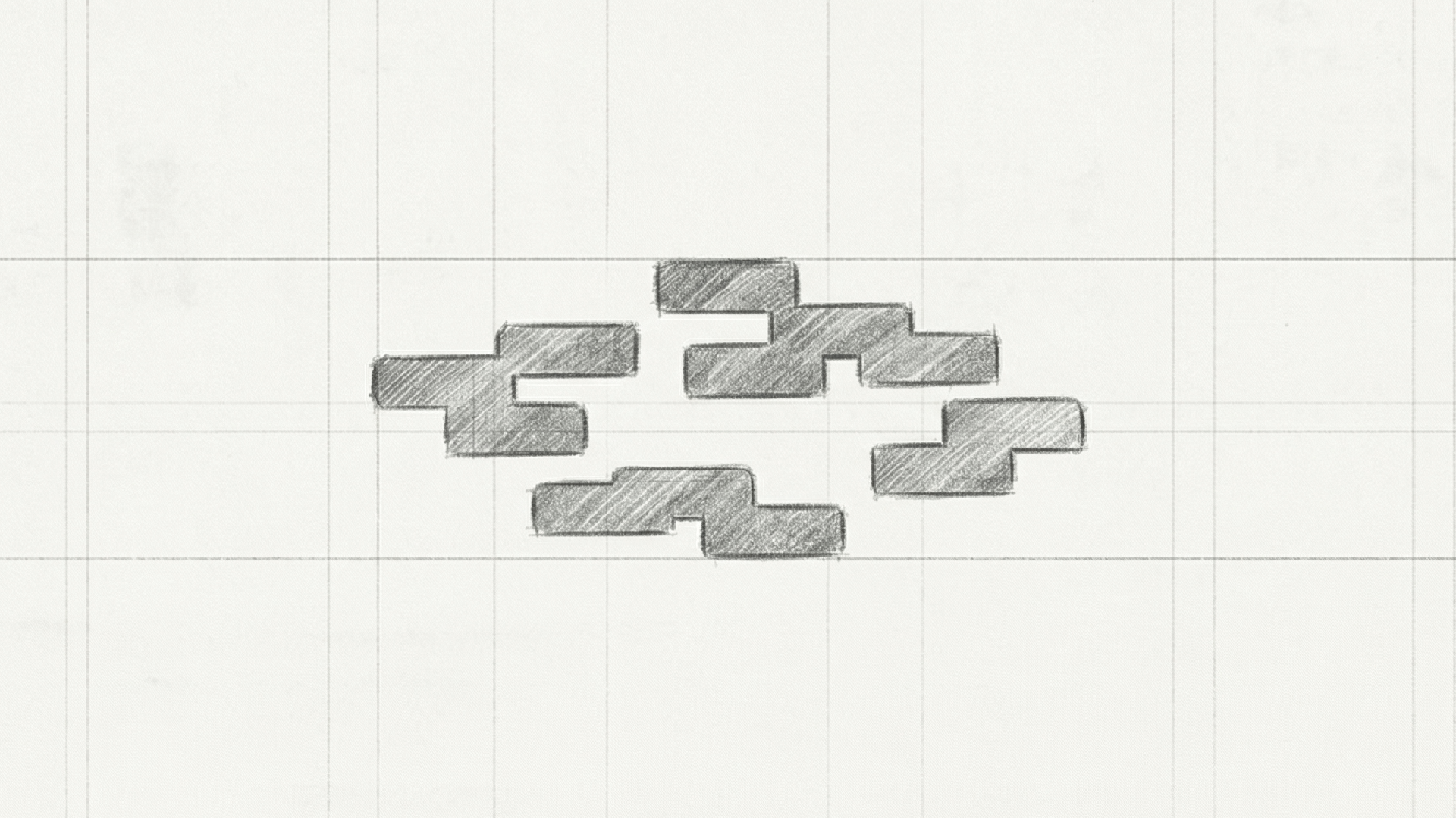
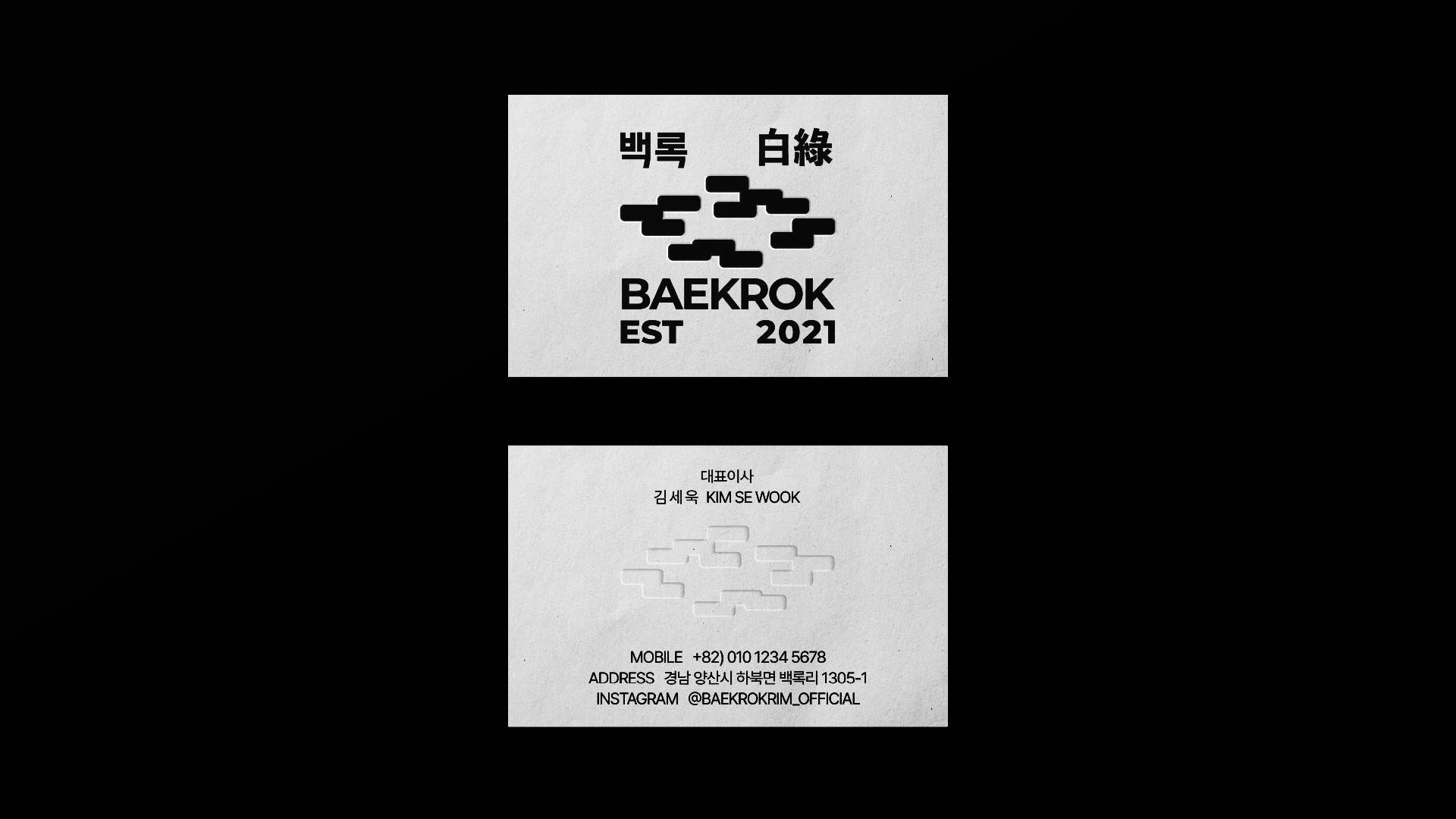
The core of this project was translating the narrative of ‘sunlight filtering through trees’ into a visual rhythm. Moving beyond a simple cafe logo, we infused the logo system with meticulously refined white space reminiscent of ceramic pieces and the soft movement of light. Through this, we aim to provide an emotional experience where the brand’s sincerity subtly seeps into the customer's daily life while they stay in the space of BAEKROK.


Client: Beakrok
JDNS
Creative Direction: Jayden
Brand Design: Jayden